Ohio Legal Help Removing Barriers to Access to Justice
Highlights
-
3.7 millionusers assisted since launch
-
959.8Kvisits in 2024
-
46%of users have a disability
-
70%of users access the website on a mobile device
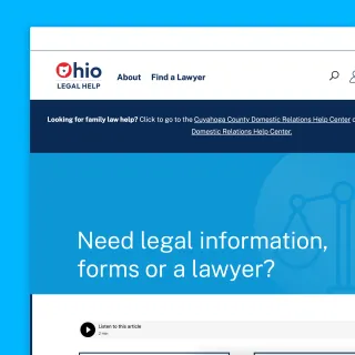
Ohio Legal Help (OLH) works to remove barriers to the law so that all Ohioans can understand their legal options, make informed decisions and connect to legal and community resources. They are supported by organizations including the Ohio State Bar Association and The Supreme Court of Ohio. The website serves low income people throughout the state, who often can not afford private legal representation.
Capellic has worked on several foundational projects for OLH:
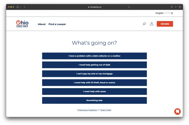
- The main website design and build that established the new organization and its services and triage system for identifying the type of help users need
- Major updates enabling users to log in and complete and save complex legal forms
- SMS notifications to remind users of critical steps in legal journeys
- Specialized pathways for victims of domestic abuse
- Virtual Self Help Centers for Ohio domestic relations courts.
The Challenge
Before building the site, we realized that it needed to function primarily as a “curation engine,” to connect a given user with the relevant documents, forms, and pro bono attorney referrals that would help them. However, each of these hand-offs was highly dependent on the individual user’s needs and circumstances. Because the particulars of these hand-offs were driven by complex rules, we could not present this in a traditional “self serve” interface, with faceted search and filters.
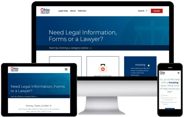
In addition, we knew this project had to be more “mobile first” than any website we had ever worked on. Data had shown that its audience overwhelmingly accesses the site through small, older mobile phones.

The Solution
The core of the site is a “mini-quiz” – a guided interface to help users see the resources that are relevant to them. It also features a flexible, powerful rules engine, which allows administrators to associate a given resource with the criteria to surface it. Lastly, while not always easy, we have tested each piece of interactive functionality, and can confirm it works just as well on a 340 pixel-wide phone screen as it does on a 5K iMac.

The Result
A Pew Report (Auburn University, 2023) featured Ohio Legal Help as a leader in legal assistance portal best practices:
- Ohio Legal Help is a national leader in providing accessible and high-quality legal information to visitors on a wide range of legal issues.
- Ohio Legal Help was one of only 17 portals with features that met each of the four key features – Ask, Refine, Learn, and Connect – identified by the Pew Charitable Trusts as essential elements that help users navigate legal issues and take informed action.
- Ohio Legal Help’s intuitive design enables users to identify and access relevant information for legal topics on the portal within short periods of time.
- Ohio Legal Help follows digital inclusiveness best practices that enable persons with low educational levels or who have disabilities to use the site, and it has robust internet security features.