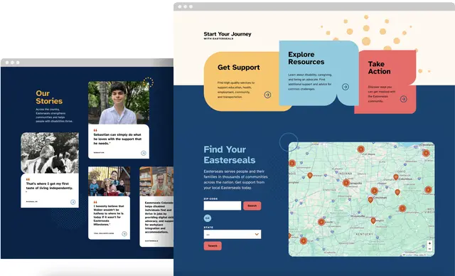
How we kept focus on accessibility during Easterseals website redesign
Learn how Capellic and Easterseals brought an accessibility lens into every step of Easterseals recent redesign.
Easterseals, one of the largest disability-focused nonprofits in the US, hired Capellic to develop a new website for its national office and a web platform for its 70+ affiliates across the country.
Web accessibility is a priority for Easterseals, not just because many program participants have disabilities. Easterseals needs its website to reflect its mission of empowering people to live independent, full lives.
Is accessibility and inclusion part of your organization’s mission? Like with Easterseals, your website is a chance to “walk the talk.”
Our web accessibility work for Easterseals took the form of six steps:
- An accessibility-focused landscape analysis to see what other nonprofits are doing on their websites when it comes to accessibility
- User interviews with recipients of Easterseals services to understand what they need from an Easterseals website
- A content strategy and content production training series anchored in plain language, readability, and comprehension
- A design process where we thoroughly evaluated colors, fonts, and layouts against WCAG 2.2 AA
- Accessibility QA conducted by a front-end developer certified in web accessibility, including automated, manual, and assistive technology testing
- Accessibility user testing, where we tested an early version of the site with people with disabilities and those who use assistive technology to navigate the web. ⭐
Accessibility-focused Landscape Analysis
While working with Easterseals, we compiled a list of organizations that worked in their field. This list included about 50 organizations, including The Arc, Special Olympics, and Understood.org.
We looked at these websites and asked:
- How accessible are these websites?
- What accessibility-related content or features are they offering to users with the aim of making their website more accessible?
- How are disability-focused websites signaling to users that they prioritize accessibility?

First, the bad news: Overlays. Despite article after article from respected accessibility experts (The A11Y Project, Perkins Access, Human Rights Lawyer Haben Girma) warning against third-party accessibility overlays, they are still very much in use today. This quote from the European Disability Forum’s article, Accessibility overlays don’t guarantee compliance with European legislation, sums up the problem with overlays, “Users of assistive technology already have their devices and browsers configured to their preferred settings. The overlay technology can interfere with the user’s assistive technology and override user settings, forcing people to use the overlay instead. This makes the website less accessible to some user groups and may prevent access to content.”
Even disability-focused websites like The Arc, Autism Speaks, BrightFocus Foundation, and Special Olympics use overlays.

In good news, many of the sites we looked at had robust accessibility statements available through their global navigation (usually in the footer). Perkins School for the Blind, Disability Rights Advocates, SCOPE, and BBC were all great models for how to position and write accessibility statements.
User Interviews
We also interviewed eight recipients of Easterseals services who either have or care for a person with disabilities to understand better what they needed from an Easterseals web presence. These interviews shaped our definition of the new site's audiences.
While most insights had to do with Easterseals-specific programmatic work, one trend might be relevant to your website: Video content as a preferred avenue for learning. The folks we interviewed said they are less likely to read a long article or webpage than watch a video.
The need for more easily consumable content delivered in formats beyond text aligns with the Universal Design for Learning principle, Multiple Means of Representation.
Content Strategy
When defining menu labels, taxonomy terms, and page content, we referenced plain language guidelines to avoid jargon, keep our sentences short, and write (wherever possible!) to an 8th-grade reading level or below.
We defined a template and component system for Easterseals and developed content storyboards with example content for each template. Easterseals staff could use these templates to help them write content that fits the new framework.
We also facilitated content training sessions and held content-focused office hours with Easterseals staff. These training sessions included guidance from established resources in the accessibility and usability space, such as the Web Accessibility Initiative, Nielsen Norman Group, Yale’s Usability & Web Accessibility resources, and The A11y Project.
Visual Identity and Design
During design, we evaluated Easterseals’ brand colors against WCAG guidelines and the new APCA color contrast algorithm (still under development and consideration for WCAG 3.0).

We identified which color combinations from their brand guide passed WCAG and which failed. We stuck with their brand colors where possible and suggested small changes to align with guidelines when necessary.
We selected Atkinson Hyperlegible for the primary site font, developed by the Braille Institute, to help low-vision readers. It improves legibility and readability through clear and distinctive letters and numbers (like by putting a slash through the zero character to help distinguish it from an uppercase O).
As we moved into page design, we continued to follow WCAG guidance to ensure we didn’t establish any design patterns that overly relied on color or other sensory characteristics.
Front-end Development and Accessibility QA
The front-end is the place where most accessibility errors exist on a website. At Capellic, accessibility is a foundational and required skill of our front-end team (our team has certifications from the International Association of Accessibility Professionals and Section 508 Trusted Tester status).
We build front-end components with accessibility at the forefront of our minds. And, as a safety net, we use the a11y addon in Storybook (which uses Deque's axe-core) during local development.
After the end of main-line development, all of the templates on the site go through a dedicated accessibility-focused quality assurance phase. This work involves running multiple automated accessibility audits (using tools like WAVE, Deque’s Axe, and Sa11y), manual checks aligned with WCAG guidelines, and testing with assistive technologies like screen readers, magnification, voice input, and keyboard-only-input.
Accessibility User Testing
Lastly (and most importantly!), we partnered with Knowbility to conduct a usability study with people with disabilities and those who use assistive technology (such as screen readers, screen magnifiers, and alternative keyboards) to navigate the web.
“I'll say this ... it's probably one of the easier websites I'll navigate today. When I come across a site like this—OK, everything is labeled, everything works right, this is cool, this is a breath of fresh air.”
—a participant who is blind and uses a screen reader to navigate the web
We tested the site with five people with the following self-reported disabilities and assistive technologies:
- Autism, chronic migraines — dim-lighting, dark mode
- Autism, blind, hearing loss, neuropathy — screen reader (NVDA)
- Blind with no light perception — screen reader (JAWS)
- Light sensitive, low vision — screen magnification (ZoomText), dark mode
- Spinal cord injury — voice input (Voice Control)
We asked each participant to complete a variety of tasks on the new site and encouraged them to “think out loud” and share their decision-making process. We also asked them to share any instances of accessibility-related barriers or frustrations.
In addition to the user experience, we asked participants to test the editor experience and log in to the content management system (Drupal) to create a page. Easterseals has many employees who use assistive technologies, and we also wanted to ensure that their experience was barrier-free.
This activity was the most important activity we did with Easterseals. We all learned a ton. Some of the major insights:
- Out of all the tests, the two screen reader users identified the most issues. There were issues with dropdowns, an embedded map, and some pages built by third parties (like the donation page).
- A request for a ‘dark mode’ version of the site came up with both the low-vision participant and the participant with chronic migraines. I didn't expect it to come up at all.
- While Drupal was accessible, both screen reader users said editors would need fairly advanced screen reader skills to use it efficiently.
- I asked each participant if they used overlays like accessiBe, and they either said “no” and moved on or went on a small rant about an experience in which the overlay actively prevented them from accessing content.
“I have dark mode enabled, but websites need to have dark mode, too. So there are some websites I can't use because they don’t have a dark mode. If I have a migraine, I need dark mode, or I can’t use the internet.”
—a participant with autism and chronic migraines
“There is a fine line you have to walk when making things accessible. Is this going to be too verbose, or is this going to be helpful?”
—a participant who is blind and uses a screen reader to navigate the web
Even though I had tested every site template with multiple automated accessibility tools before we conducted these tests, we still found a number of issues to fix. This type of individual, real-life testing is a critical step to ensure your site goes beyond standards and automated tools.
Lastly — One small curious insight is that neither screen reader participant used the “skip navigation” link in the header. When I asked them about it, both said they avoid them because they often don’t work—instead, preferring to use features within their screen readers(JAWS, NVDA, etc.) to do similar things.
Our Accessibility Roadmap
While we were lucky to do a lot of accessibility-related work for the initial release of the new Easterseals website, we still want to do more. Some of the accessibility-focused items we hope to release soon:
- Integrate the Editoria11y Accessibility Checker into the editor experience. This tool will flag accessibility issues a content editor may have inadvertently introduced, allowing them to fix them before they publish.
- Conduct another round of accessibility user testing with Knowbility, primarily focused on those using screen readers, as most accessibility-related issues came from them in the first test.
- Integrating a dark mode feature that relies on a user's system-wide default preferences and conducting another accessibility user test with people with low vision, individuals with chronic migraines, and others who might benefit from dark mode.
Reflecting on what we did for Easterseals, there are a couple of things that I personally would like to take into the next project and that I’d suggest you consider for yours:
- Advocate for the Accessibility User Testing activity. If there is more budget, bring in 10 testers instead of just 5.
- Consider integrating a dark mode feature from the start. It will be easier to incorporate if considered during the initial design process.
I hope our experience with Easterseals provides some inspiration or guidance for integrating accessibility into your next project.