

insights

Twice a year, I run a “performance report” for a handful of clients. We look at how each site is doing from an accessibility, SEO, and page speed perspective and provide a few recommendations for fixing the most critical issues.
Recently, I've noticed that some recurring accessibility challenges often stem from content entry. These include things like headings appearing out of order or links using generic text such as "click here" or "learn more."
While we typically provide web content training for editors when we first release a new site, that knowledge tends to fade over time, especially when considering staff turnover and new teams and departments brought into the website content creation process.
While we work hard to ensure our design and code meet accessibility best practices, content is one area where it's hard for an outside agency to ensure quality on any ongoing basis. Agencies can provide tools and training, but the content you produce for your site is ultimately in your hands.
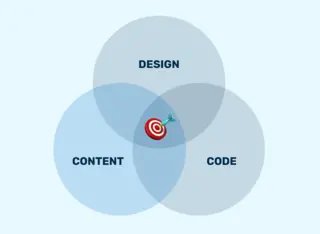
Creating an accessible site requires expertise in three broad disciplines: code, design, and content.
Maintaining accessible content requires a particularly high level of diligence and coordination compared to the other two disciplines, mainly because content changes so frequently, and the number of people (with various levels of familiarity with web accessibility) who produce content for your site.
With every new page published or edited, you are opening up an opportunity for an accessibility bug to get on your site. And since you likely have a few different people from different departments creating content for your site, it’s hard to ensure that everyone has received the proper training on how to produce accessible content for the web.
There are two primary best practices at the intersection of accessibility and content:
The Web Content Accessibility Guidelines (WCAG) are a set of 86 widely agreed-upon international standards for website accessibility.
Some of these 86 success criteria fall to content editors to ensure compliance.
Things like:
Since the WCAG documentation can be overwhelming, I don’t often send content editors directly to WCAG when I run accessibility-focused content trainings. A more approachable reference is Yale’s WCAG 2 A and AA Checklist for Content Editors.
The other framework is the U.S. General Services Administration’s plain language guidelines, which they produced to help make government communications easier for the public to read, understand, and use.
While these guidelines were initially produced for the government, the web accessibility and usability communities have adopted them.
Plain language guidelines include things like:
When I run accessibility audits, there are three bugs that I find almost every time introduced by content editors:
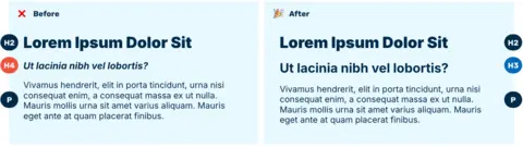
When an editor adds headings (h2, h3, h4, etc.) to their content and those headings are not ordered sequentially, they are causing an accessibility issue.
It is common for your website visitors who use screen readers or other forms of assistive technology to navigate a site by headings. Reading through the headers helps to get an understanding of the content on the page and to quickly navigate to a particular section.
When editors skip or incorrectly order headings, it creates a confusing outline for users.
This issue is usually caused by editors who prefer the visual treatment of one particular heading over another. They select a heading for aesthetic reasons, rather than the headings' inherent semantics.
If this issue continues to pop up despite training, it might be worth revisiting the default heading styles on your site or providing other ways for editors to give visual emphasis to their content.
Another issue I see a lot is headers without any content. This is usually the result of one of two issues. Either an editor was trying to add some white space and put in an empty header, or they copied and pasted their content in from something like Microsoft Word, and that paste came along with some unnecessary HTML.
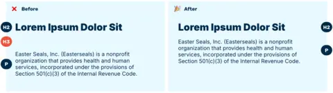
This issue has a similar effect on people who are trying to navigate a site by headers. Empty headings result in a confusing heading outline.
If this issue continues to pop up, it might be worth giving editors more control over the white space between their content, with things like horizontal rules, or reviewing content production workflows to see if those headers are getting added accidentally.
The last of the content-related accessibility issues I see most often is the use of “undescriptive link text.” This is when editors add a link with text like “learn more” or “click here.”
Just like with headings, some of your website visitors who use screen readers (and other assistive technology) will navigate a site by listing out all of the available links on a page.
When you use links with undescriptive text, someone navigating the site by links won’t understand what the link is about since it has been taken out of its surrounding context.
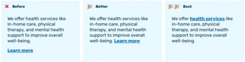
The issue of undescriptive link text is related to two WCAG Success Criteria: 2.4.4 Link Purpose (In Context) A and 2.4.9 Link Purpose (Link Only) AAA. Putting the link with the undescriptive text in a paragraph that provides sufficient contrast adheres to the level A criterion (shown in the middle “Better” option in the image). Replacing the undescriptive link text with something more descriptive meets both the Level A and Level AAA criteria (shown in the “Best” option in the image).
While checklists, like the one from Yale, are great for manually analyzing your writing, automated tools can help flag accessibility issues buried in large chunks of text.
I regularly use these three tools when performing quick automated accessibility tests:
Note: Automated testing tools are not a substitute for manual accessibility testing by an expert or people with disabilities. Automated testing typically only identifies 30-60% of accessibility errors.
We include the Editoria11y Accessibility Checker Drupal Module in all our projects. We like this module for a few reasons:
Lastly, there are some subscription-based tools that scan entire websites. A few of the more popular ones are Siteimprove and Acquia’s Optimize. These tools are typically pretty expensive, but they scan every single page on your site and can help you spot patterns. We recommend investing in tools like this if your site has a lot of content and is produced by lots of different people.
Building and maintaining an accessible website is a group effort. It requires a strong partnership with an agency and consistent attention and training.
By avoiding the common mistakes outlined in this article – incorrect heading orders, empty headings, and undescriptive link text – and utilizing a few automated tools, you can significantly improve the accessibility of your website.
Implementing these best practices not only benefits users with disabilities but also the overall usability and clarity of your content for all visitors. Let's strive to create digital spaces that are inclusive and accessible to everyone.
